A convincing pasta render needs readable pieces, sauce highlights and a serving that sits naturally inside its plate. Treat those as separate decisions. Increasing gloss across the whole material rarely fixes a plate that looks like a patterned solid mound.
This Blender workflow focuses on gnocchi, fusilli with pesto and spaghetti with ragù. It extends the general food PBR workflow with a specific question: how can you preserve the distinction between pasta and sauce when both appear in the same tileable texture set?
The textures are surface resources. They do not supply individual pasta meshes, an ingredient mask or a sauce simulation. Build the shot around the parts they can describe, then add geometry or authored masks for the details your camera actually needs.
Design the serving around the chosen view
Place a simple plate and serving volume before working on the shader. Decide whether the camera sees mostly the top, a low side angle or a fork lifting food. The top of a background serving can rely more heavily on surface detail; a lifted strand needs an actual outline and thickness.
Create a shallow, irregular mound that leaves some plate visible. A perfectly spherical serving tends to advertise the material preview rather than a meal. Compare the mound with photographic reference and give it a plausible contact area instead of letting it hover above the plate.
Keep one fork or spoon in the scene as a familiar size reference. Follow the consistent asset scale guide when assembling the plate, cutlery and table. Fix their dimensions before using UV scale to decide the apparent size of each pasta piece.
Choose a pattern that matches the pasta shape
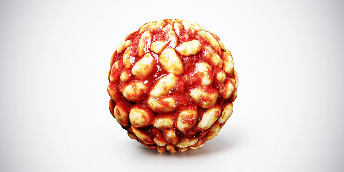
The gnocchi with tomato sauce material has rounded pale pieces separated by red sauce. It works best when the serving outline supports that compact shape. A few modeled gnocchi along the front edge can make the transition from textured center to visible silhouette more convincing.
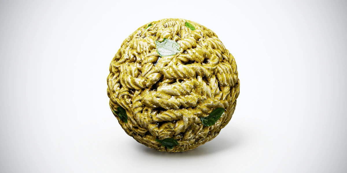
The fusilli with pesto texture introduces short spiral forms and green sauce. Inspect how those spirals follow the mound. If they stretch into long ribbons on steep sides, adjust the surface and UVs before adding detail. A dense pattern needs enough visual separation to remain readable at the final image size.
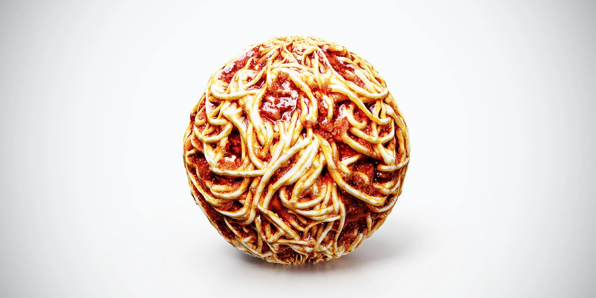
The spaghetti with ragù texture contains long overlapping strands. Keep the clearest curves in the camera-facing region and place seams away from them. Where strands hang over the plate or wrap around cutlery, use separate geometry with a compatible material treatment.
Establish a restrained base material
Connect Base Color, Roughness and the OpenGL normal map using consistent coordinates. Refer to the PBR texture setup guide for channel interpretation. Start with non-metallic behavior: a bright sauce reflection is not a reason to increase Metallic.
The Principled BSDF reference distinguishes surface roughness from metallic response. For this study, keep the shader simple while judging the supplied maps. Avoid introducing a coat, scattering and strong displacement simultaneously, because you will not know which change caused an improvement or an artifact.
Save a neutral version and compare any adjustment against it. Use one camera, fixed exposure and a consistent light arrangement. If the entire dish is too bright, first determine whether the problem is the light, the image interpretation or a material adjustment rather than darkening every texture.
Separate wet sauce from exposed pasta carefully
A combined food texture may already contain useful roughness variation between ingredients. Inspect that map before replacing it with one low value. Flattening all variation can turn the whole serving into a polished shell and erase the difference between pasta, herbs and sauce.
If you need more control, author a mask for the sauce regions you want to adjust. Do not assume that selecting red pixels gives a clean sauce mask: browned pasta, shadows and other ingredients may share similar colors. Refine the mask against the Base Color and inspect its borders under moving light.
Use a restrained remapping of roughness within that mask, preserving local variation where possible. The roughness-map guide explains why reflection shape matters more than an arbitrary claim that food should be glossy. Compare the result with the specific sauce reference instead of applying one wetness setting to tomato, pesto and cream.
At hero distance, a visible pool or drip may need its own mesh. A painted wet patch cannot create the thickness of sauce crossing a plate rim. Give that geometry a deliberate contact shape and check that it does not intersect the plate or create a floating edge.
Use relief where it helps piece separation
Inspect the normal detail at a low strength first, then compare it with the intended serving size. Stronger relief can make compact gnocchi look deeply cracked or turn fine spaghetti strands into sharp ridges. Keep the large mound shape in the mesh and use the maps for smaller surface cues.
Height-based displacement requires its own geometry and renderer setup. It can add useful relief, but a height field does not reconstruct every overlapping pasta strand or the space beneath it. The normal-map troubleshooting guide helps diagnose shading problems before you increase complexity.
Check the front edge in silhouette with the material temporarily simplified. If the serving still looks like a smooth dome where separate pieces should be visible, add a small number of foreground pieces. Place them to support the pattern and the camera, rather than distributing detail uniformly where it will never be seen.
Shape the highlights without hiding the ingredients
Start with a broad key light placed to one side of the serving. Change its position until reflections describe the sauce while the pasta remains readable. A highlight covering the whole center may be bright but can remove the ingredient information you need.
Use the product lighting workflow to compare the material under a repeatable setup. Keep a second, more neutral lighting check available if the final scene uses a strong warm restaurant atmosphere. That extra view helps distinguish an intentional mood from a color or roughness mistake.
Do not use deep shadows as the only separator between pieces. Allow enough fill to read the sauce color in the gaps while retaining contact and form. Check a small output preview as well as the full-resolution render: intricate strands that disappear after downsampling do not justify more texture detail by themselves.
Resolve the most visible failure first
| Symptom | Likely decision to revisit |
|---|---|
| Food looks like a printed dome | Serving silhouette and foreground pieces |
| Every ingredient has the same shine | Roughness variation and sauce mask |
| Spirals stretch on the side | UV distortion and mound steepness |
| Dark crevices dominate the plate | Relief strength, lighting and occlusion treatment |
| Sauce floats above the plate | Contact geometry and thickness |
Approve the shot with its plate, cutlery and intended background. Record the pattern scale and any authored sauce mask so a later camera change is manageable. For other serving patterns, compare the food material collection after the test scene is stable. Match the texture to the dish you are making, and let the modeled pieces handle the visible shapes that maps cannot supply.