Food PBR textures work best when the mesh supplies the serving shape, the image pattern matches its scale and the highlights support the food’s actual surface. A detailed texture cannot turn an arbitrary sphere into a convincing dessert by itself.
This workflow uses three small studies: a pie top, an ice cream scoop and a coffee surface. Each exposes a different limitation of material previews. You will decide what to model, set the pattern size and inspect the result before adding more shader complexity.
If you need the foundation first, the PBR material overview explains how color, roughness and normal data describe a surface. The exercise below applies those roles to food-specific modeling decisions.
Choose the camera before choosing the amount of geometry
Start with a reference and the intended view. A background bakery shelf, a tabletop product render and a close-up advertisement require different amounts of visible form. Identify the surfaces and outlines the viewer will actually see.
For a pie, that might be the upper crust, rim and an exposed cut edge. For an ice cream scoop, the rounded body and irregular lower edge matter. For coffee, the cup rim, liquid level and meniscus define how the surface sits inside its container.
Block those forms with a simple neutral material first. If the serving cannot be recognized without the texture, decide whether the missing information belongs in the mesh. Do not judge geometry only from above when the final shot is taken at table height.
Assign each texture to a suitable part of the serving
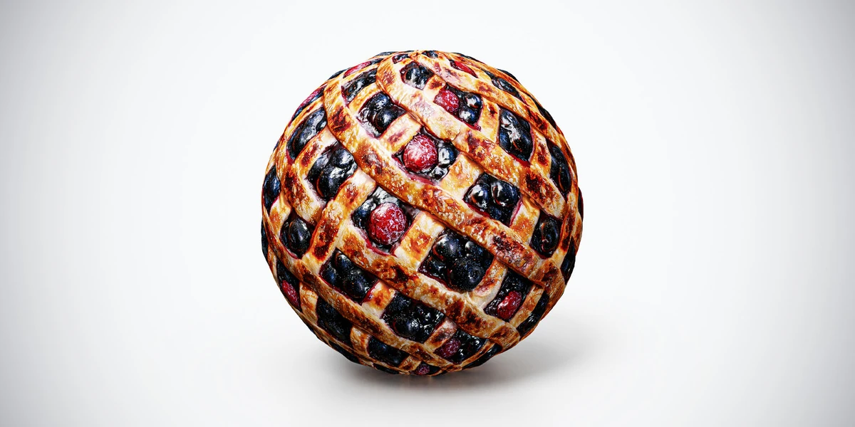
The berry pie PBR material contains a strong lattice and berry pattern. It can describe the upper surface of a modeled pie, while the outer rim and any visible filling edge need their own treatment. Repeating the same top pattern over a vertical cut face would suggest an implausible construction.
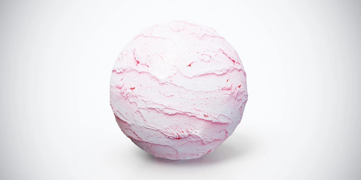
The strawberry swirl ice cream texture adds pale ridges and scoop-like marks. Use those as surface detail on a deliberately shaped scoop, not as a substitute for its overall volume or irregular outline.
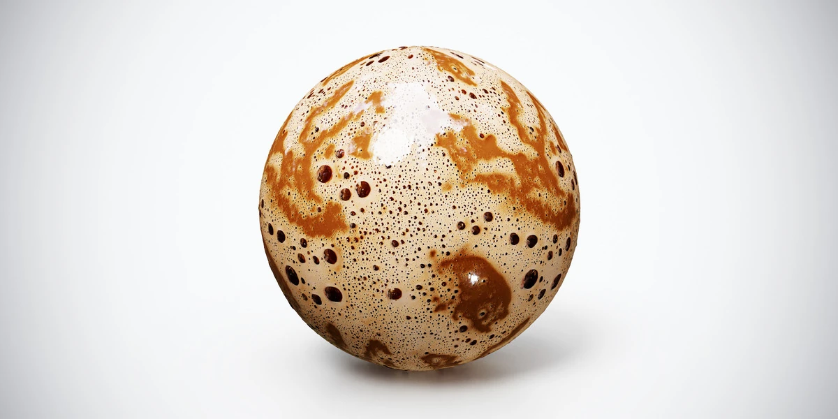
The coffee foam texture is suited to a beverage surface where bubble scale can be compared against a cup. A thin modeled surface can carry the pattern, while its contact with the cup is handled separately.
These examples are texture sets. The preview sphere does not imply that a pie mesh, scoop, cup, fluid simulation or individual berries are included. Review the asset’s listed contents before planning the scene around additional files.
Match pattern size to a familiar object
Use a spoon, plate or cup as a scale reference. Set the dimensions of the serving before adjusting UV coverage. Then inspect one recognizable detail: a berry, a pastry strip, a scoop ridge or a large bubble.
If the product does not specify a physical capture size, choose coverage from the reference rather than inventing a scanned measurement. The guide to consistent scale across 3D assets helps keep those choices coherent within a tabletop scene.
For a pie top, check where the lattice meets the rim. For a scoop, inspect stretching near the UV seam and poles. For a drink, make sure the largest bubbles do not imply a cup much smaller than the surrounding props.
Do not shrink the whole pattern simply to hide a repeated berry. Adjust its placement, change the camera or introduce selected geometry where necessary. When the pattern stretches with the mesh, use the UV distortion workflow before looking for a higher-resolution texture.
Build a simple non-metallic material first
Connect the supplied color, roughness and normal maps before adding effects. For these ordinary food surfaces, begin with non-metallic behavior. A glossy glaze, moist berry or coffee highlight does not make the material metal.
Use the PBR texture setup guide to check data-map interpretation and normal connections. All maps belonging to the same surface need consistent coordinates. A separately shifted roughness image can make highlights appear on the wrong berries or ridges.
Start with a restrained setup and compare it with the reference under neutral illumination. Keep a saved version before adjusting values. There is no single roughness setting that makes every food appealing: a dry crust, exposed fruit and foam represent different surfaces.
Do not assume that a standard color/normal/roughness set includes a subsurface mask, a wetness mask or separate ingredient selections. If a scene needs those controls, create them deliberately and verify their alignment with the supplied images.
Separate small shading detail from visible relief
Normal and bump detail can help ridges, pores and bubbles read under light, but they do not create the serving’s outline. A lattice strip that crosses a visible pie edge, a berry protruding from the filling or a scoop hanging over a cone may need geometry.
Use Height cautiously if you decide to add displacement. Blender’s displacement guide explains the distinction between altered shading normals and actual mesh displacement. True displacement needs sufficient mesh detail; it is not free geometry supplied by the image.
Inspect the side profile with and without the effect. Avoid turning soft ice cream ridges into rock-like shelves or making coffee bubbles resemble deep craters. Choose the technique that supplies the missing feature rather than maximizing every available map.
For a background serving, a simpler surface may already be adequate. For a hero close-up, model a few foreground details that support the texture and break its repeat. The normal-map troubleshooting guide provides a useful check when stronger shading creates more problems than detail.
Use scattering only when the reference calls for it
Some food surfaces benefit from light scattering beneath the surface, but enabling it everywhere can erase useful distinctions. First make the geometry, pattern scale and reflections understandable without relying on scattering to soften every error.
Blender’s Subsurface Scattering reference describes a model for internal scattering in materials such as milk or wax. Its presence in the renderer does not mean a food texture pack provides measured scattering parameters.
For an ice cream study, compare the effect under a side light while keeping the serving dimensions fixed. Watch whether shadow boundaries become more plausible or merely washed out. Retain the version that follows the reference. There is no universal value that transfers unchanged between a tiny scoop and a large stylized dessert.
Treat foam and baked pastry as their own material questions. Copying the same scattering settings from one ingredient to every other component can make the entire plate appear waxy.
Light the surface so the ingredients remain readable
Use a broad key light for form, then change the light angle to inspect the small surface features. Keep exposure and camera fixed while comparing shader changes. The HDRI product-lighting guide offers a repeatable setup for this process.
If everything looks like plastic, investigate the roughness response before darkening the color or adding more normal strength. If the dish looks flat, check light direction and geometry before assuming the maps lack detail.
| Problem | Useful next check |
|---|---|
| Lattice pastry looks printed onto a flat lid | Rim shape, visible relief and camera angle |
| Ice cream resembles carved stone | Ridge scale, excessive relief and surface finish |
| Coffee looks like a solid patterned ball | Liquid surface shape, cup contact and bubble size |
| Every ingredient has the same wet highlight | Roughness interpretation and ingredient separation |
Test one neutral light arrangement as well as the intended presentation lighting. A warm café mood can be attractive, but it should not be the only condition in which the material is readable.
Approve the result at the final serving size
Render the actual composition before choosing the largest maps. The texture-resolution guide helps assess whether extra image detail is visible at that distance. Make the same comparison after importing into a game engine if that is the destination.
Check the visible silhouette, serving scale, UV seam, contact with the container and consistency of highlights. Save those decisions with the material so a later camera change does not turn into guesswork.
Use the food PBR collection to compare alternative ingredients and surfaces once the test scene is stable. Choose a texture because its pattern serves the modeled food and the intended shot; keep the geometry and lighting responsible for the parts they can actually describe.