To light a product with an HDRI in Blender, connect an Environment Texture to the World Background, load the HDR image, and inspect the scene in Rendered view. Then rotate the environment to shape the reflections before adjusting brightness. The most useful lighting setup makes the object’s shape and materials easy to read.
An attractive background alone does not guarantee an informative product render. A dark metal surface may be reflecting an empty part of the environment. Fabric that looks flat may need a different light direction rather than a stronger normal map.
This workflow uses Cycles and a simple product scene. It covers loading the environment, separating lighting from exposure, and comparing materials without changing several variables at once. If material channels are unfamiliar, start with the practical introduction to PBR.
1. Prepare a Scene You Can Compare
Choose one object, one camera, and a plain ground plane. Disable additional lights temporarily so you can see what the HDRI contributes. Keep the camera and object fixed throughout the first lighting comparison.
Give the ground a restrained, non-metallic material. A highly reflective floor introduces another prominent reflection and can distract from the product. Check that the object actually meets the ground: an accidental gap is easy to mistake for weak contact shadows.
Add two temporary reference spheres beside the object: one with a matte gray material and one with a smooth metallic material. They serve different purposes. The matte sphere helps you judge the overall lighting gradient; the reflective sphere shows where bright and dark parts of the environment sit. Remove them from the final composition.
Before adjusting the light, confirm that the product’s texture maps are connected correctly. Follow the Blender PBR texture setup guide if you need to check Roughness, Metallic, or Normal inputs.
2. Choose an HDRI for the Lighting Job
Choose the environment by the light it provides, then consider the background. For a readable catalog image, look for a clear separation between illuminated and shaded surfaces without losing important details. For a mood image, allow more contrast while keeping the product identifiable.
The 3DSkillUp HDRI collection includes outdoor environments with different sun positions and surroundings. Two options for an intentional comparison are:
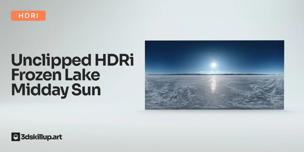
- Frozen Lake Midday Sun HDRI: a bright winter environment with a clear sun direction. Use it to examine harder shadow edges and concentrated reflections.
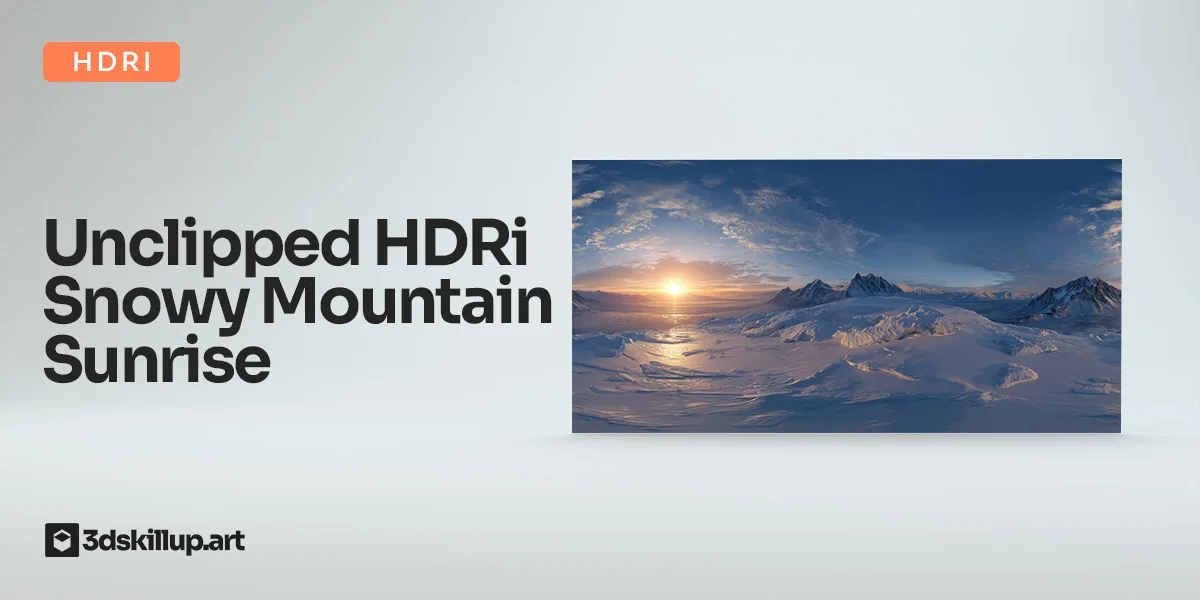
- Snowy Mountain Sunrise HDRI: an early-morning environment with warmer light and a low sun. Use it to explore a warmer presentation and longer shadows.
Use these environments to explore different lighting moods. Include a neutral studio check when accurate material evaluation matters.
Download the actual HDRI supplied with your chosen asset, typically an HDR or EXR file. A JPEG product preview is not a substitute for the original high-dynamic-range lighting data. Also check the supplied projection instead of assuming every environment image uses the same layout.
3. Connect the HDRI to the World
In Blender, select Cycles as the render engine, then open the Shader Editor and switch its context from Object to World. Enable nodes if necessary.
- Add an Environment Texture node and open the HDRI file.
- Set its projection to Equirectangular for a conventional latitude–longitude panorama.
- Connect the Environment Texture’s Color output to the Background node’s Color input.
- Connect the Background output to the World Output node’s Surface input.
- Begin with Background Strength at 1 as a comparison baseline, not a universally correct exposure.
- Switch the viewport to Rendered and look through the camera.
Blender’s World Environment documentation explains the background shader, while the Environment Texture reference describes image projection and color-space handling. Preserve the appropriate color interpretation for the HDRI; do not assign Non-Color simply because you used that setting for a roughness map.
The World represents a distant environment. A floor visible inside the panorama is not ground geometry that your product can touch. Keep the actual ground plane for local contact and shadows.
4. Rotate the Environment Before Raising Its Strength
Add Texture Coordinate and Mapping nodes to the World shader. Connect Generated → Mapping Vector, then Mapping Vector → Environment Texture Vector. Leave the scale at 1 on each axis and start with all rotation values at zero.
Adjust the Mapping node’s Z rotation to move the environment around the scene. Blender’s Mapping node reference describes its vector transformations.
Try a simple comparison: save previews at 0°, 30°, 60°, and 90°. These are exploration increments, not recommended final angles. Keep World Strength, exposure, camera, and materials unchanged. Choose the orientation that best explains the object.
Look for three things:
- Silhouette: can you separate the product from the background?
- Form: do light and shadow describe the object’s curves and planes?
- Surface: do the reflections reveal useful differences between materials?
On a metal leg, a narrow highlight may explain the shape better than a bright frontal reflection. On upholstery, a light coming across the surface may reveal seams more clearly than light aligned with the camera. If the first angle looks poor, explore the direction before changing the shader.
5. Separate World Strength from Exposure
World Strength changes the contribution of the environment. Exposure changes how the rendered scene is presented through color management. With additional lights in the scene, this distinction becomes especially useful: increasing World Strength changes their balance, while exposure changes the overall image.
Choose a view transform and keep it consistent during comparisons. AgX is a useful starting point for handling bright highlights. Blender also offers Khronos PBR Neutral for product-oriented color reproduction under suitable lighting, particularly grayscale illumination. Neither option removes a color cast coming from the environment. See Blender’s display and view transform documentation.
Adjust exposure in small steps and watch both highlights and shaded details. Do not brighten everything just to reveal one dark region. First ask whether that region faces away from the light or reflects a dark part of the environment.
After establishing a useful HDRI baseline, you can add an area light if a particular feature needs a controlled highlight. Give it a specific task, such as separating an edge, and compare with that light disabled to see whether it improves the product’s readability.
6. Check Materials Without Hiding Their Problems
Lighting review and material review should support each other. If every surface looks equally glossy, check the roughness setup. If only one viewing direction looks wrong, inspect the environment and reflections before repainting the textures.
The guide to roughness maps in PBR explains how surface finish affects reflection shape. In your test scene, look for deliberate differences between fabric, paint, plastic, and exposed metal. A uniformly noisy roughness map may create activity without communicating any useful material structure.
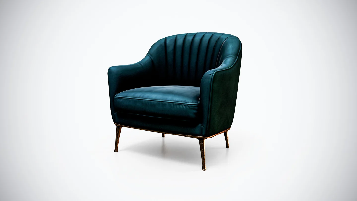
For a furniture exercise, the Velvet Lounge Armchair model provides a subject with teal upholstery and metallic legs. Try the midday environment first, then the sunrise environment. Keep the camera fixed and compare whether the legs remain distinct from the floor and the channel detailing remains readable.
If you adjust exposure between environments, record the change. Otherwise, it is easy to credit a different HDRI for an improvement caused mainly by a brighter presentation.
Troubleshooting HDRI Product Lighting
| What you see | What to check first | A useful next step |
|---|---|---|
| The World appears as a flat color | Image loading and the Environment Texture connection | Reopen the HDRI and verify the Color-to-Background link. |
| Metal looks almost black | The environment reflected toward the camera | Rotate the HDRI and inspect the reflective reference sphere. |
| The product appears to float | Ground contact and the direction of illumination | Correct the object’s position before increasing light strength. |
| Materials look washed out | Exposure, World Strength, and the selected view transform | Return to the comparison baseline and adjust one control at a time. |
| Every surface looks similarly shiny | Roughness maps, values, and color-space interpretation | Check the material connections before adding more lights. |
| The background looks good but the product is unclear | Light direction and silhouette contrast | Rotate the environment while judging the product, not the landscape. |
Save a Repeatable Lighting Baseline
Before finishing, save a separate lighting-review scene with the environment filename, Z rotation, World Strength, exposure, view transform, and render engine recorded. Keeping these settings together makes later revisions easier to compare.
Check the final image at its intended display size. A highlight that looks elegant in a large preview may disappear in a marketplace thumbnail; a seam that dominates a close-up may be irrelevant in the final composition.
Keep one neutral material-check render alongside the more expressive presentation. The aim is to show both what the asset looks like and how clearly its materials respond when the lighting changes. Start with one environment from the HDRI collection, complete the controlled comparison, and only then decide whether the scene needs another light.