Use an HDRI for surrounding light and reflections; use area lights when you need direct control over a highlight or shadow. Combining them works well when each source has a clear purpose. Adding more lights without deciding what is missing often makes a product harder to read.
This guide is a comparison exercise for a small Blender product scene. It assumes that your environment already works; use the HDRI setup workflow if you need the initial World connection. The goal here is to decide what deserves an additional light, rather than building a fixed three-light recipe.
Define the feature the viewer must see
Choose one product and write down its most important visible feature: a curved handle, engraved border, soft cushion or thin metallic edge. Frame that feature before adjusting the light. If it faces away from the camera, brighter illumination may reveal more surface without explaining its shape.
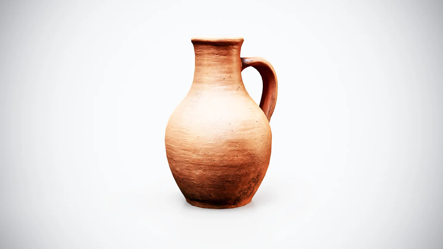
A Medieval Terracotta Pitcher makes a useful practice subject because the rounded body and handle need different kinds of separation. You can use any comparable object already in your library. First look for a readable body gradient and an open gap inside the handle; leave tiny surface imperfections until later.
Lock the camera, material, exposure and view transform during the first comparison. Otherwise an apparent lighting improvement may actually come from a changed material or a different presentation transform. Save a reference render that you can compare beside each new attempt.
Render the environment alone
Disable the scene’s other lights and rotate the HDRI around the vertical axis. Examine the bright side, dark side and outline independently. Does the object have volume? Is the handle separated from the body? Are reflected shapes helping or obscuring the design?
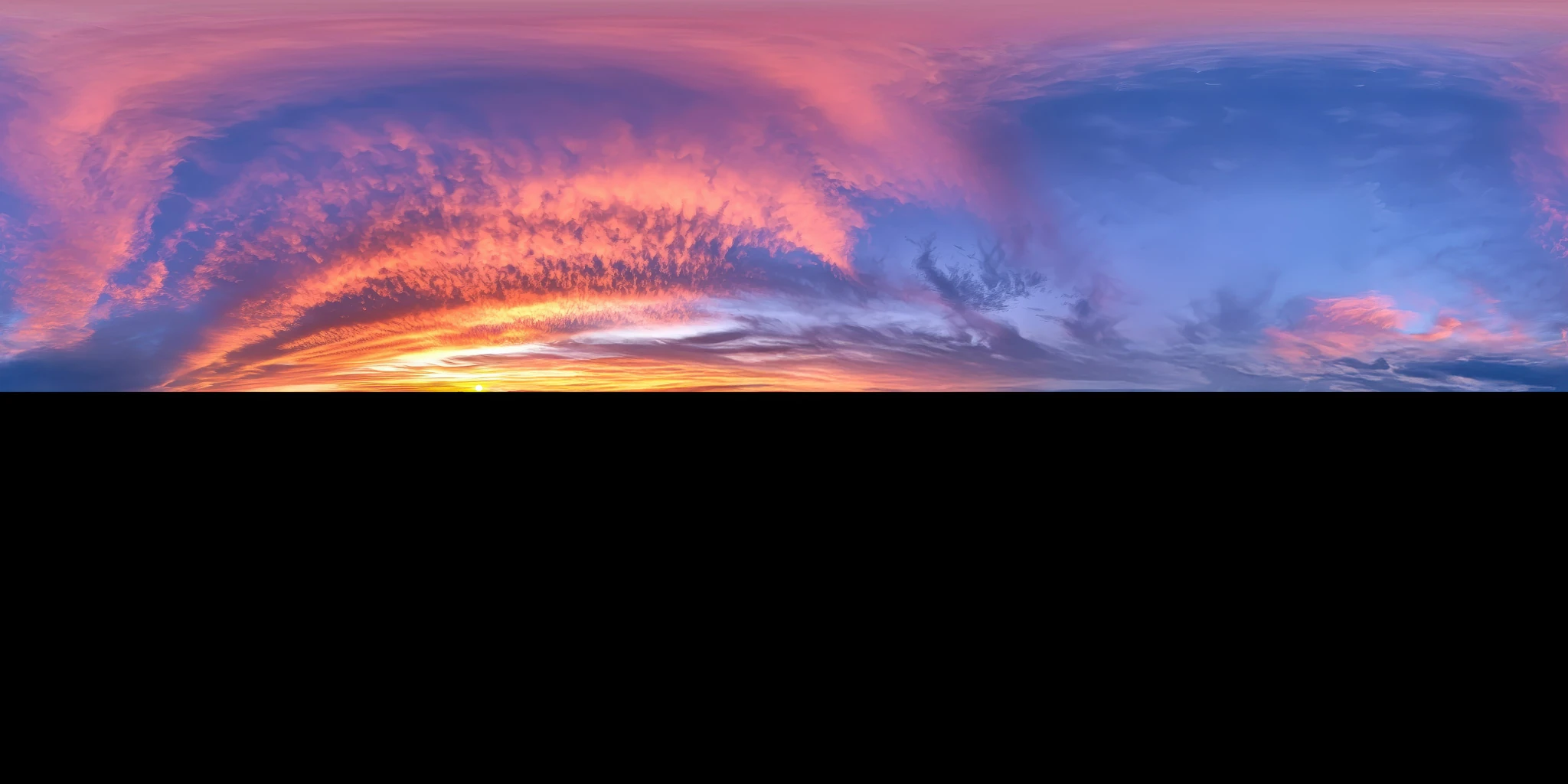
The Clear Blue Horizon HDRI provides a comparatively simple sky for this exercise. Its supplied preview has a black lower half, so inspect the actual HDR file and use your own ground where the scene needs local surfaces. The Vibrant Sunset Clouds HDRI is an alternative when colored cloud reflections are part of the intended presentation, not a neutral reference.
Keep the distinction between attractiveness and legibility. A vivid sunset may be ideal for a mood image but make it difficult to judge a product’s base color. Choose the environment’s role deliberately using the outdoor HDRI selection guide.
Add one area light to solve one problem
Suppose the body reads clearly but the handle disappears into shadow. Add an area light and position it so that the handle gains separation. Render again, then disable only that new light. If you cannot name the improvement, remove or reposition it before adding another.
Blender’s light-object reference describes area sources and their shape controls. A rectangular source is useful when you want an elongated reflected shape. Its apparent size from the subject matters to the shadow and reflection, so evaluate size and distance together rather than copying a power value from an unrelated scene.
Move the light before increasing its power. A bright source on the wrong side may wash out the surface while leaving the important contour hidden. After changing its size, recheck brightness as well; keep exposure fixed so that you can see what that light actually changed.
Separate reflection problems from roughness problems
A broad white reflection can hide details on a smooth product. That does not automatically mean its roughness map is wrong. Temporarily move the source: if the obscured area moves with it, reflection placement deserves attention first.
Use the roughness-map guide when the surface response remains implausible under several lighting arrangements. Changing roughness only to hide one awkward highlight may make the material look wrong from every other angle. Conversely, a light cannot restore missing detail in an incorrectly connected map.
For a useful three-render comparison, save environment-only, area-only and combined images. The area-only render can use a dark World for diagnosis; it need not be the final presentation. Name the files clearly and review them at the same size.
Keep the floor and background consistent
A light added for the object also affects nearby surfaces. Check whether it creates a second shadow, an unexpected bright patch on the floor or a background gradient that competes with the silhouette. A good close-up highlight may be a poor choice for the full shot.
Follow the HDRI ground-plane workflow when contact is the problem. A pictured ground surface in an environment image cannot receive a new contact shadow from your model. Use local geometry or an appropriate compositing setup for that interaction.
Use a simple decision table
| What you see | First adjustment | What to avoid |
|---|---|---|
| Useful surroundings but a hidden contour | Position one area light for separation | Raising every light together |
| Distracting shapes in a reflection | Rotate the environment or move the local source | Immediately repainting roughness |
| Two competing cast shadows | Disable the added light and compare | Assuming more sources always look more realistic |
| Attractive mood but unclear product color | Make a separate neutral evaluation view | Treating the mood shot as a color reference |
| Flat form under broad light | Adjust source direction and contrast | Adding detail to compensate for weak shape |
Finish with a lighting setup you can explain: one source supplies the environment, another reveals a specific feature, and the ground anchors the subject. Browse the HDRI collection when the surrounding reflection itself needs to change. A better-matched environment can eliminate several corrective lights.