A realistic concrete wall in Blender starts with believable surface scale, a non-metallic shader and lighting that reveals the finish. Increasing texture resolution or normal strength cannot compensate for pores that look like craters or a wall that reflects like polished plastic.
This workflow builds a small architectural test scene before adding weathering. You will compare concrete finishes, set the texture scale, isolate shading problems and decide which details deserve geometry. The aim is a wall that holds up in your final camera, not just on a material preview sphere.
1. Choose the concrete finish before connecting textures
Concrete is a family of surfaces. A smooth interior partition, a poured structural wall and an exposed retaining wall can differ in pore size, formwork marks, stains and roughness. Gather references for the specific construction and condition you need.
Compare three things before choosing a texture: the size of the most recognizable marks, the direction of the surface pattern and the contrast of its stains. A heavily weathered material may work outdoors but dominate a clean interior. A fine finish may disappear in a distant shot, which can be perfectly appropriate.
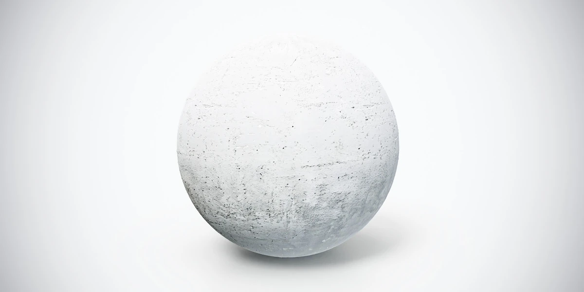
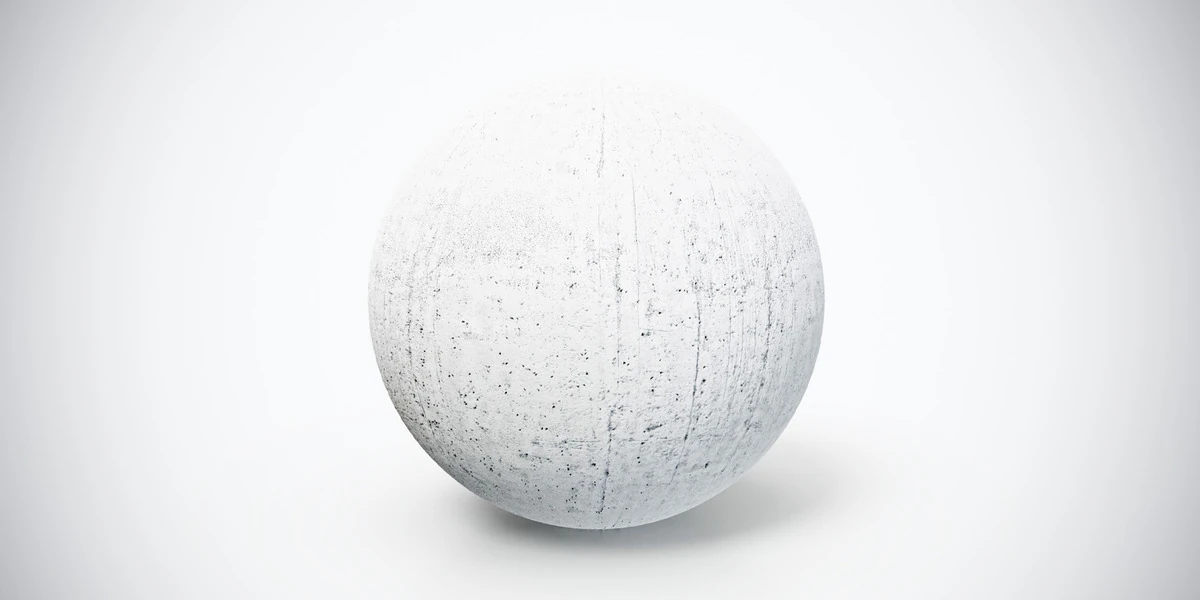
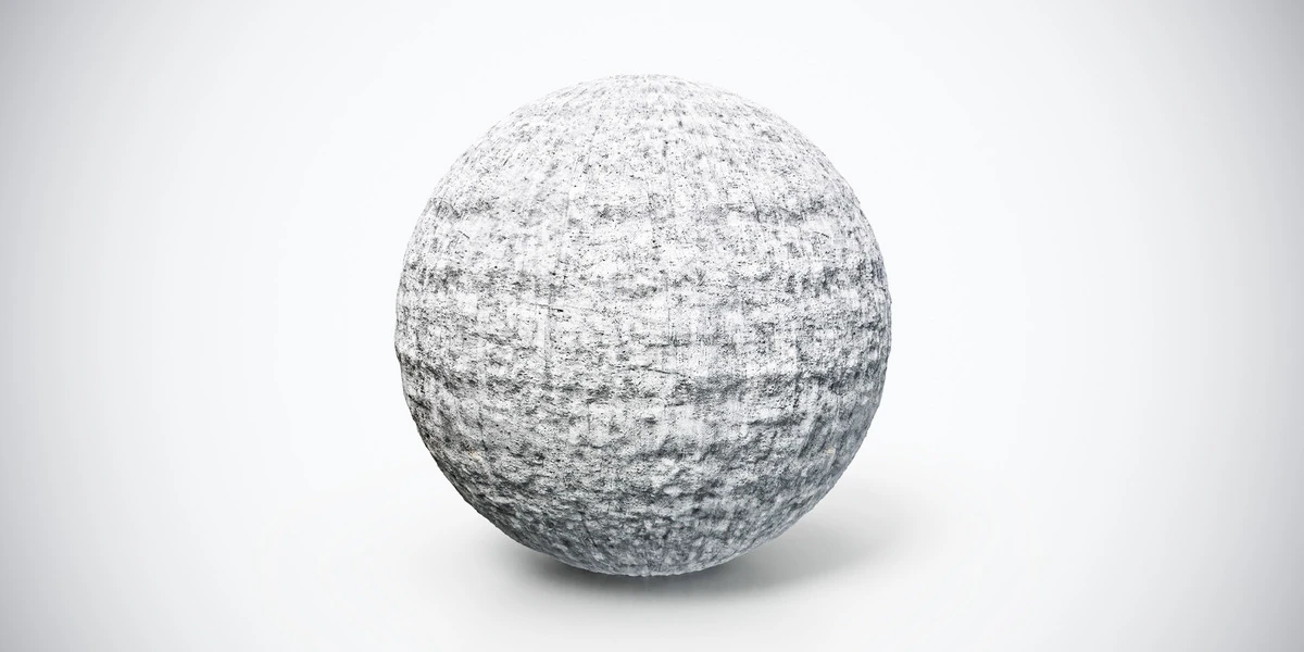
For a quiet architectural surface, the light concrete PBR texture provides a useful starting point with small marks and subdued variation. A wall that needs visible vertical surface character can instead use the white concrete wall material. For rougher construction, compare the stronger horizontal marks in the rough concrete wall texture.
These are alternatives, not layers that must all appear in the scene. Select one for the main wall and keep the others available for a controlled comparison. The texture’s product preview helps you choose character; your own scene determines whether its scale and contrast fit.
2. Build a wall test with a scale reference
Make a simple wall with thickness, a floor and a doorway or a reference object with known dimensions. Set the dimensions before unwrapping. On a simple unrigged test mesh, applying object scale before the unwrap helps keep later operations predictable.
Place one camera at the intended viewing distance and another close enough to inspect the surface. Keep exposure and lighting unchanged between material comparisons. If you change the material, camera and light together, you lose the ability to identify which change helped.
Apply a checker texture first. Its squares should remain square, and similarly sized wall sections should show similar checker sizes. Correct stretching before substituting the concrete maps. Pay particular attention to narrow reveals around doors and windows: fitting every face into a convenient UV rectangle can distort those surfaces.
A small bevel can make a wall edge catch light, but choose its width from the construction reference. A broad rounded bevel will not become realistic simply because the wall has a detailed material.
3. Connect a minimal, inspectable PBR material
Use one coherent texture set and one shared UV mapping path. Start with Base Color, Roughness and Normal; leave Height and AO disconnected while you establish the baseline. The existing Blender PBR texture setup guide covers the complete node connections.
For conventional PNG PBR maps, treat Base Color as color information and the roughness and normal images as Non-Color data. Feed the normal image through a tangent-space Normal Map node before connecting it to the shader. Keep ordinary exposed concrete non-metallic.
Give every map the same UV coordinates and texture transform. A common mistake is adjusting the Base Color mapping while leaving Roughness or Normal at a different scale. The stains then stop lining up with the pores, and the surface becomes harder to diagnose.
Temporarily disconnect the normal input if the result looks lumpy. If the color and reflection are plausible without it, the issue is probably in normal interpretation or strength rather than the entire material. The underlying distinction between material properties and illumination is explained in the practical PBR introduction.
4. Set physical texture scale before choosing resolution
Judge the size of pores, streaks and casting marks beside the doorway. A texture covering a whole building facade once will communicate a different surface from the same texture repeated across each panel.
If a texture has documented physical coverage, use that measurement. Otherwise, choose a plausible coverage from references and record it as an art-direction decision; do not present an estimate as a scanned measurement.
For example, suppose you decide that one square texture repeat represents a two-meter square of wall. A four-meter-wide, three-meter-high wall then spans two repeats horizontally and one and a half vertically. Those unequal repeat counts preserve the square texture’s physical proportions on the rectangular wall. They do not mean stretching the image to make the wall fit one UV tile.
After the scale is believable, compare available map resolutions at the final output size. The guide to choosing texture resolution for 3D assets explains why screen coverage matters more than the largest number in the download. A higher-resolution image preserves finer information; it does not make oversized pores smaller.
5. Diagnose roughness under moving light
Use a broad light to judge the overall finish, then move a light to a shallow angle across the wall. Keep the camera fixed. Observe whether highlights describe a mostly matte surface with local variation, or whether the entire wall appears coated.
Before editing the map, confirm that it is actually Roughness rather than Glossiness and that its color-space setting is correct. Lower values in a roughness workflow give sharper reflections. Moving every value toward black to reveal more detail can accidentally turn dry concrete into a glossy surface.
Adjust the map’s range gently while preserving its variation. Do not assume every dark stain must also be shiny: surface color and microsurface finish describe different properties. The roughness-map workflow helps separate those decisions.
For the final comparison, use the same neutral environment across all candidates. The HDRI lighting test for Blender materials gives you a repeatable way to rotate illumination without rebuilding the material around one flattering highlight.
6. Separate pores, construction joints and wall damage
Small pores and fine surface grain can read through the normal map. Doorway profiles, broken corners and broad construction joints need a different decision because they affect form and, often, silhouette.
Do not expect a normal map on a flat plane to produce a broken outline. Model visible corner damage when the camera can see it. Use displacement only when the shot benefits from actual surface relief and the chosen renderer, settings and geometry support it.
Adding the same height detail as strong bump on top of an already detailed normal map can exaggerate the surface. Compare normal-only, height-based detail and their combination separately before committing. A quiet material usually benefits more from correct scale than from stacking every available map.
Place construction joints according to the building, not according to where the texture happens to repeat. If you also need masonry alongside the concrete, the modular stone and brick wall workflow explains how to align courses and handle corners.
7. Add weathering with a reason
Once the clean wall works, identify where water could run, where people touch the surface and where objects shelter it. Local staining beneath a sill has a clearer cause than uniform dirt sprayed over every face.
Use broad, restrained variation to interrupt repetition without repainting every pore. Keep structural features, drains and nearby props responsible for the largest marks. Inspect the wall at normal camera distance: tiny variation that looks impressive in a close-up may add no useful information to the shot.
The concrete material collection is useful for comparing finishes when the selected base is fundamentally wrong. If the reference calls for a clean interior wall, replacing a heavily distressed base can be more effective than trying to remove every stain through shader adjustments.
Troubleshooting the final wall
| Symptom | Check first | Useful correction |
|---|---|---|
| Pores resemble large dents | Texture coverage and normal strength | Fix scale, then reduce exaggerated shading detail |
| Concrete looks like plastic | Roughness interpretation and lighting | Confirm Non-Color data and inspect a broad moving reflection |
| Stains repeat across the whole facade | Recognizable marks and repeat spacing | Introduce construction-led variation after scale is correct |
| Corners remain perfectly flat | Actual mesh silhouette | Model the forms visible in the camera |
| Surface looks soft despite large maps | UV distortion and screen coverage | Compare UVs and resolution at the intended distance |
Save the accepted wall as a reference scene with its chosen coverage, camera and lighting. Before reusing it elsewhere, check those assumptions again. A reliable concrete material is one you can explain and reproduce, not one that only works in a single dramatic render.