A small interior scene becomes readable when every object has a job. Choose a focal object, give the viewer a clear route toward it, and add only the supporting furniture and props that explain the space. A larger asset collection does not automatically produce a stronger composition.
This exercise builds one camera view of a lived-in room corner. It is deliberately narrower than a complete game level: the goal is to practice arrangement, scale and visual hierarchy with a few reusable assets. For broader style decisions, begin with the guide to matching game assets to a visual style.
Write a one-sentence scene brief
Describe the occupant and the moment. For example: “A quiet reading corner has just been left in a hurry.” That sentence gives you practical placement questions. Where would someone sit? Which surface would hold a book? What would be moved aside to stand up?
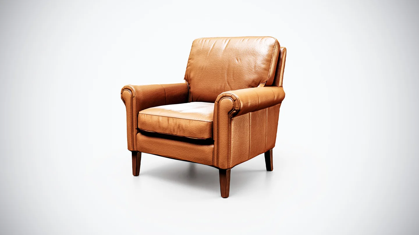
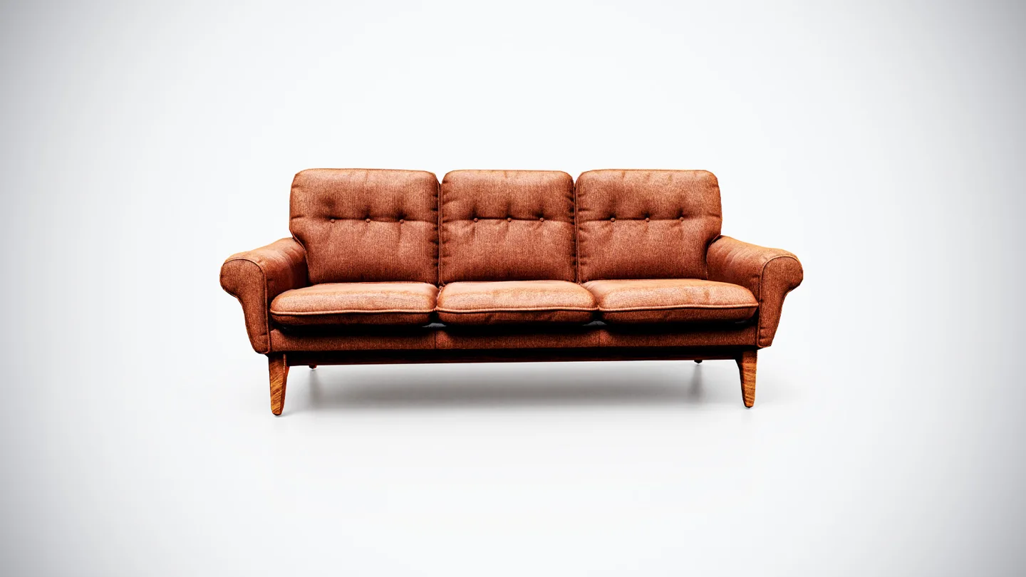
Choose one focal object before opening the entire asset library. The Vintage Leather Armchair can anchor a single-person reading scene. A Vintage Fabric Sofa with Mid-Century Style suggests a different arrangement and footprint. Use these as alternative starting points; the exercise does not require both.
Write down the intended output too: a portfolio still, an environment concept or a walkable game space. A single-camera study allows selective detail, while a navigable scene must remain plausible outside that one framing. Do not hide a blocked doorway merely because the current camera cannot see it.
Block out the space before adding materials
Use simple shapes for the wall, floor, furniture and any table. Check proportions against a person-sized reference. Leave enough space for the imagined occupant to sit, stand and move. Even a still image can feel wrong when the arrangement implies impossible use.
Place the camera while the scene is still plain. A low viewpoint can emphasize furniture mass; a higher one reveals the relationships between objects and circulation space. Neither is automatically better. Choose the height that communicates your scene brief with the least explanation.
The consistent scale guide helps when mixed sources disagree. Resolve those differences now. Later material detail can distract from an oversized chair or an implausibly narrow gap, but it will not correct them.
Give the silhouette room to breathe
Look at the focal object as a dark shape. Can you distinguish its arms, legs and back from the room behind it? Move a table or adjust the camera if several edges line up accidentally. These tangencies often make a useful object look like a confusing cluster.
Leave some quiet space around the focal area. This does not require an empty room: it means that nearby shapes and contrasts should support the important object. A bright wall mark directly behind a chair leg may compete more strongly than a much larger low-contrast object elsewhere.
Render a small grayscale preview to compare light and dark masses. If everything attracts attention equally, decide what should become quieter. Moving an object or simplifying the background is often more useful than adding a decorative detail to the foreground.
Add a small number of story props
Select supporting props by the actions in the brief. A vessel beside a seat suggests a different activity from tools beside a workbench. Group related objects where they could realistically be used, and leave usable surfaces partly open.
Avoid distributing clutter at evenly spaced intervals. That can look like a display of assets rather than a room. Instead, give each group a reason: something recently handled, something stored, or something waiting to be used. Rotate and offset objects carefully without creating intersections.
The interior storytelling guide explores how period and material choices affect atmosphere. This composition exercise adds another constraint: if a prop does not improve the story or the silhouette in the target view, try removing it before finding a more detailed replacement.
Limit the competing material signals
Choose a restrained family of major surfaces, then reserve stronger contrast for the focal area. A heavily patterned floor, brightly colored chair, glossy wall and busy rug may all work individually while competing as a group.
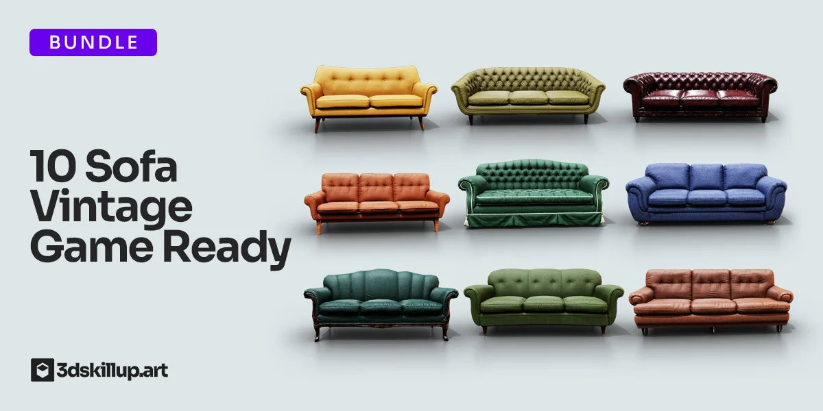
When testing different furniture from the Vintage Sofa Bundle, swap one candidate at a time. Recheck the footprint and camera after each swap; a replacement with different proportions may change the whole arrangement. Treat the bundle as a set of alternatives, not an instruction to fill the scene with every included model.
Check wear placement as well as color. Similar age does not mean identical scratches everywhere. Supporting pieces should feel compatible without all carrying the same dominant pattern.
Use light to reinforce the hierarchy
Choose a believable direction for the principal light and inspect the result on simple materials. The focal object should remain readable without relying on an extreme exposure difference. A dark background can separate a pale chair, while a softer background may better suit a dark silhouette.
If a single feature needs attention, the HDRI and area-light comparison provides a controlled way to add a source. Do not brighten every object individually; doing so can remove the hierarchy you created through placement.
Review the scene in three passes
| Pass | Question | Change to try |
|---|---|---|
| Thumbnail | What do I notice first? | Reduce contrast around competing shapes |
| Normal viewing size | Can I understand the room’s use? | Clarify furniture spacing and prop groups |
| Close inspection | Do contact and intersections hold up? | Correct placement, scale and visible seams |
Keep the blockout render beside the finished image. If the original arrangement reads more clearly, restore its simplicity before polishing further. Browse the game-ready model collection to fill a specific gap in the composition, then repeat the three-pass review after inserting the new object.