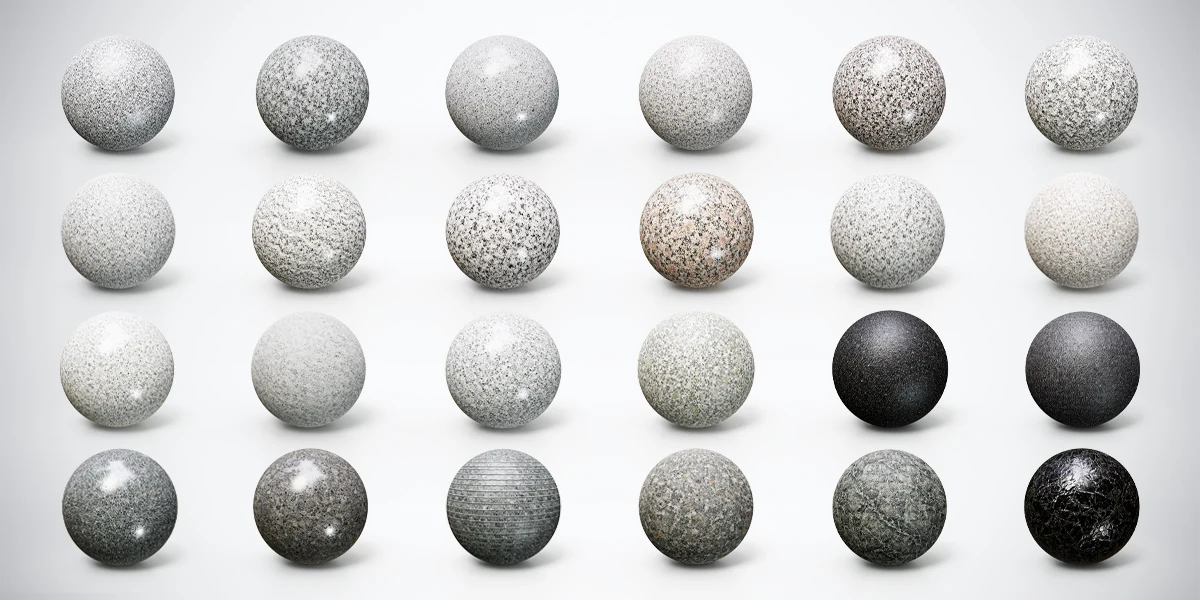
Choose a stone material by the pattern and surface response your camera needs, then check whether it belongs on the object. A fine speckled granite can support a quiet background; a high-contrast marble vein can direct attention across a focal surface. Neither choice is automatically more realistic or more suitable for a detailed render.
This guide uses a small reception scene with a counter, a wall panel and a display plinth. The task is to make three surfaces work together without turning the room into a material sample catalog. You can repeat the exercise for a kitchen, a bathroom visualization or a game environment.
These are visual selection decisions. Texture names alone do not establish a stone’s geological identity, physical durability or suitability for real construction. For the shading foundation, review what PBR materials represent, then evaluate the candidate maps on your own geometry.
Compare grain, veins and finish separately
A material thumbnail mixes several decisions into one image: the underlying pattern, its scale, its color, the roughness response and the preview lighting. Separate those decisions before selecting a favorite. A broad highlight can make a modest pattern look dramatic; a dark environment can hide detail that becomes prominent in your scene.
Start with the visible pattern. Fine speckles distribute detail across a surface. Coarse grains create larger light-dark changes. Veins introduce a direction that can reinforce a composition or cross it awkwardly. Grooves introduce a repeated structure that may need to follow the object’s intended construction.
Then compare finish under the same lighting. A polished appearance does not require making stone metallic. Epic’s physically based material reference distinguishes metallic response from roughness; ordinary uncoated stone belongs to the nonmetal side of that distinction. Judge reflection sharpness separately from the choice of grain or veins.
| Visual feature | A useful scene role | First thing to inspect |
|---|---|---|
| Fine, restrained speckles | Supporting counter or wall surface | Whether the grain stays visible at delivery size |
| Coarse contrasting grains | A broad surface needing variation | Whether bright flecks compete with the subject |
| Strong directional veins | Focal panel, tabletop or plinth | Where the dominant vein enters and leaves the frame |
| Dark polished appearance | Contrast around a pale object | Whether reflections preserve the object’s silhouette |
| Linear grooves | A deliberately directional surface | Alignment with panels, edges and joints |
Assign one dominant surface and two supporting roles
Write a short scene brief before browsing materials. For this exercise: “The reception counter should attract attention; the wall should frame it; the plinth should support one displayed object.” That sentence gives each material a reason to exist.
Try a veined counter, a quieter light wall and a dark plinth. Then reverse the emphasis: use a restrained counter and put the strongest veins on the wall. Both can work, but compare them from the same camera so you can see what changed. Avoid replacing all three surfaces between renders.
Use the small interior composition exercise if the room does not yet have a clear focal point. Stronger textures rarely solve an arrangement in which several objects already compete for attention. Set the material hierarchy after the main shapes read clearly.
The 24 Granite, Marble & Stone 4K PBR Materials Bundle provides a useful range for this comparison: pale and warm granites, coarse and fine patterns, dark stone appearances and two veined marble variations. Select three candidates by role rather than trying to use all 24 in one room. Its 4K textures and Metallic-Roughness, Unity and Unreal presets support different project workflows; the artistic selection still needs this camera-based review.
To try the exercise with a free surface, start with Warm Pink and Black Granite in 2K. Its warm light areas and contrasting dark flecks make it useful for testing whether a patterned counter supports the focal object or competes with it.
Establish pattern size on a flat sample
Create a rectangular test surface with dimensions comparable to the object. A sphere is useful for studying reflections, but a flat panel makes the size and repetition of the pattern easier to judge. Place a simple dimension reference beside it and keep that reference consistent between candidates.
Choose one recognizable feature, such as a broad vein or a large grain cluster. Ask how large it should appear on the counter. Do not assign real-world coverage from the phrase “4K”: pixel dimensions do not specify how many meters the image represents. Where coverage is undocumented, record your mapping scale as a visual choice based on references.
For a simple calculation, a full texture repeat covering 0.8 meters will repeat three times along a 2.4-meter counter. That may suit subtle grain but expose a distinctive vein three times. Moving the UV origin changes where those repeats begin; it does not remove their spacing. Use the texture repetition workflow for general repeat detection, then decide whether this particular stone needs a different placement or a different candidate.
Treat vein direction as part of composition
Position the strongest vein while viewing the final camera. It might lead toward the displayed object, frame an empty working area or divide the surface into distracting halves. Rotate the complete material coordinates to test the direction, keeping all associated maps aligned.
Inspect the corners and front edge too. A vein that appears attractive on the top may restart abruptly down the front. Decide whether that edge belongs to a continuous slab, a separate strip or a deliberate joint. The stone countertop mapping guide works through those options on a simple Blender model.
Avoid manufacturing continuity by stretching one axis until unrelated marks meet. That changes the apparent material structure across the object. A different offset, a planned seam or another part of the texture can be a more convincing answer. If no placement survives the important views, reject the candidate instead of hiding the problem in a single flattering angle.
Keep lighting steady while comparing finish
Use a saved PBR material test scene with a fixed camera, exposure and environment rotation. Render the same three objects with candidate A, then B, then C. Compare pattern scale first; otherwise you may prefer one image simply because its grain happens to be larger.
Inspect both a broad face and a rounded edge. The broad face shows how the surface contributes to the composition; the edge reveals how its reflection changes across viewing angles. If a dark stone looks featureless, check what it reflects before raising the material brightness. An empty or uniformly dark environment may provide little useful reflected structure.
After selecting a provisional palette, test it under the final scene lighting. The HDRI and area-light comparison is useful when a focal surface needs a more deliberate highlight. Keep this as a second review, separate from the controlled material comparison.
Review at thumbnail, delivery size and close range
Save three views of the preferred palette. At thumbnail size, check which surface attracts attention first. At the intended delivery size, judge whether grain, veins and reflections remain readable. In a close view, inspect repeated marks, UV seams and transitions at edges.
Write down one reason to keep each material. “Quiet enough behind the chair” is more useful than “looks realistic.” Also record one condition that would make you replace it, such as a vein crossing the main object’s silhouette or grain disappearing at the required camera distance.
Do not increase texture resolution as the first response to every failure. A large pattern that competes with the subject needs a composition or scale decision. A convincing material that becomes soft after import needs a technical check. Use the Blender, Unity and Unreal stone validation checklist for that second situation.
Keep a small material decision sheet
Record the chosen finish, the object it serves, the apparent texture coverage, the UV orientation and the lighting used for approval. Include the final-size render, not just a close-up sphere. This gives you a repeatable reference when another artist adds a panel or when the same scene moves to a different engine.
Approve the palette when the important object remains readable, the stone pattern fits the construction and the materials hold together under the intended lighting. Keep unused candidates available as alternatives. A coherent scene usually benefits more from a few well-placed surfaces than from displaying every variation in a bundle.