A useful PBR material test scene holds the presentation steady while you change one material decision at a time. It helps you separate an incorrect map connection, an unsuitable pattern scale and an awkward reflection before those problems become mixed into a finished environment.
Build this as a small Blender file that you can reuse. It does not need a complex studio set or a library of paid models. A plane, a rounded object and a beveled block are enough to expose several common issues. The goal is a repeatable comparison rather than the most flattering possible material preview.
Give each test object a specific job
Use a flat plane to inspect tiling, seams and pattern scale. Add a sphere or smoothly curved object to inspect how the material responds across a range of surface angles. Use a beveled block to check edges and the transition between broad faces.
Keep the dimensions known and record them in the scene. A wood pattern that looks plausible on a small sample may be much too large on a cabinet door. Add a simple ruler object or a reference cube of known size beside the sample, then hide it for the final presentation if necessary.
Do not assume the sphere proves that the material is ready for every object. A directional texture can look attractive on a curved preview while running the wrong way across a real furniture component. Each test shape answers a different question.
Connect the maps before adjusting their appearance
Follow the Blender PBR texture setup guide for the initial shader. Confirm which map belongs in each input and whether the package actually includes it. Do not invent a metallic map for a material set that does not supply one.
A tangent-space normal image needs a Normal Map node rather than a direct connection to the shader’s normal input. Blender’s Normal Map documentation also specifies matching UV coordinates and Non-Color interpretation for this data. Inspect the map’s documented convention before diagnosing inverted detail as a lighting problem.
Connect one channel at a time. Begin with base color, add roughness, then enable the normal contribution. Save a comparison after each step. If the surface suddenly looks wrong, the last change gives you a specific place to investigate. Leave height-based effects out until the simpler channels behave predictably.
Match pattern size before comparing resolution
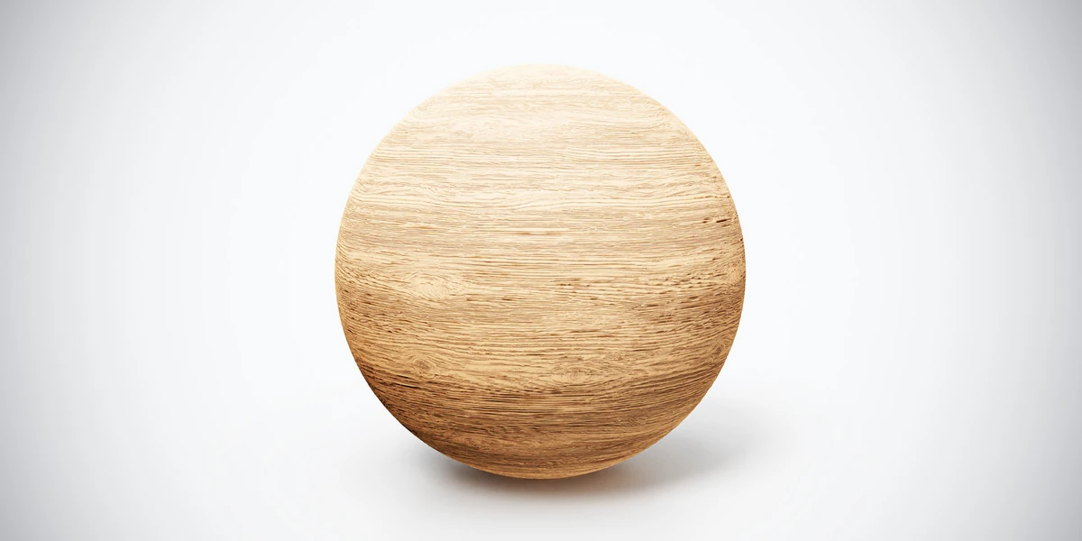
Apply Fine Wood Grain PBR Texture to a panel-sized sample and a narrow strip. The subtle grain makes a useful test of direction and scale without requiring a busy decorative pattern. Align the maps through the same coordinate transform so that color, roughness and normal detail remain registered.
Use the furniture grain-direction workflow when different parts need different orientations. Then compare the material at the actual camera distance. Increasing image resolution cannot correct grain that runs across a leg in the wrong direction or repeats at an implausible size.
For example, if a square map repeats four times across a two-meter plane, each full repeat covers half a meter in that direction. This is only a scene-scale calculation; it does not prove the real-world capture size of the texture. Where the creator does not specify a physical coverage, use reference images and the intended object to choose a plausible scale.
Lock a neutral lighting baseline
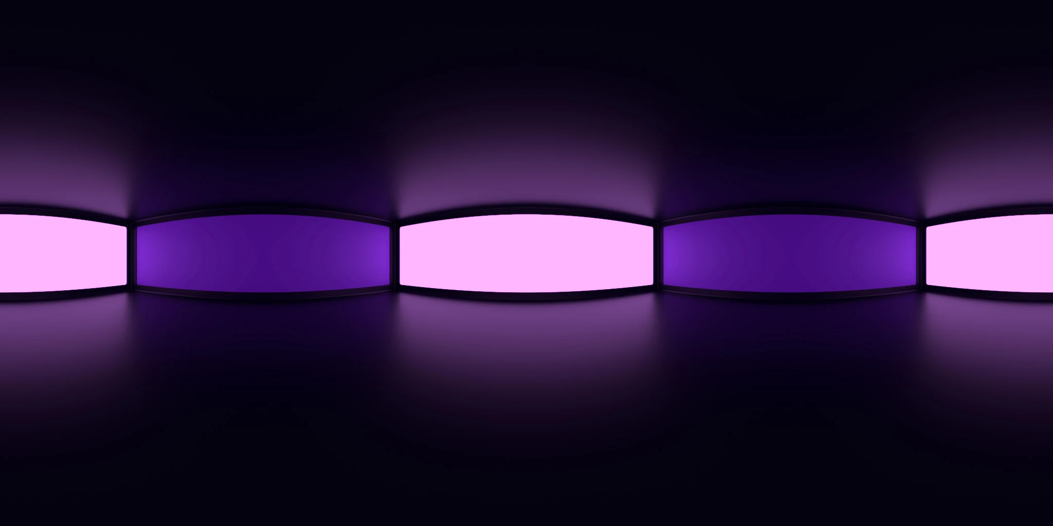
Choose one environment and keep its rotation fixed for the first comparison. Studio 021 HDRI is a candidate for inspecting rectangular and octagonal reflection shapes against a neutral studio setting. Use the actual HDR file rather than the website’s preview image.
Fix the camera, exposure, view transform and render settings. Save a baseline image, then change only one material property or map. If you alter the environment at the same time, you will not know whether a broader highlight came from the surface or the light source.
A neutral-looking setup is useful for comparison but is not a calibrated color measurement. Record it as your working baseline. After a material passes that baseline, test it under the lighting planned for the final scene, including any warm or strongly directional sources.
Use a second material to challenge the setup
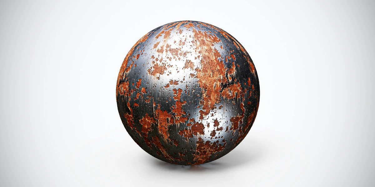
A scene built around wood can hide problems that become obvious on metal. Try Rusted Metal PBR Texture on the same test forms. Inspect where corrosion, exposed surface and roughness variation remain readable. The aim is to test the inspection scene, not to force unrelated materials to produce identical highlights.
If the wood looks convincing but the metal becomes a featureless bright patch, first rotate the environment in a separate diagnostic render. If both materials show the same shading seam, investigate the test object’s geometry, normals or UVs before blaming two different texture sets.
Keep this alternate-lighting image separate from the baseline series. A useful comparison has a clear question: map correctness, scale, response under a second environment or performance at the delivery distance. Combining all four into one changing render makes the result difficult to interpret.
Record decisions in a small comparison table
| Test | Keep fixed | Change | What to inspect |
|---|---|---|---|
| Map connection | Geometry, UVs and lighting | Enable one map | New artifacts or implausible response |
| Physical pattern scale | Camera and material values | Coordinate scale | Grain size, seams and repeat spacing |
| Resolution | Framing and pattern scale | Texture resolution | Visible detail at delivery size |
| Lighting robustness | Material and object | Environment orientation | Whether the surface still reads plausibly |
Use the texel-density guide when several objects need consistent detail. A material comparison alone does not establish that the whole scene uses its texture budget efficiently.
Save the scene with a useful handoff note
Keep the material files organized, identify the asset source and record any edits to the supplied maps. Note the object dimensions, coordinate scale, environment file and rotation, view transform, exposure and render engine. These details make the comparison repeatable when you revisit it later.
Save an untouched template separately from the material-specific tests. Before using a tested surface in production, check it on the actual mesh at the final camera distance. The reusable scene should help you make a decision quickly; the destination scene remains the final check of whether that material belongs on the object.